Which Typography Basics Every Creative Professional Should Know
Typography is one of the most essential elements in visual design, yet it is often underestimated by beginners and even some experienced creatives. It influences how content is read, interpreted, and experienced across different platforms, from websites and mobile apps to branding and print materials. A well-thought-out typographic system improves clarity, strengthens hierarchy, and enhances overall user experience. On the other hand, poor typography can make even the most well-designed layout feel unprofessional and difficult to engage with. Understanding typography basics allows creative professionals to communicate ideas more effectively and maintain consistency across their work. This article explores the fundamental principles of typography, including structure, spacing, hierarchy, and practical application, helping designers build a strong foundation for creating visually balanced and readable compositions.
Understanding Typography as a Core Design Element
Typography is not just about selecting a visually appealing typeface, it is a structured system that supports communication. Every typographic decision contributes to how information is perceived by the viewer.
In design practice, typography helps establish:
- Visual hierarchy
- Content organization
- Brand tone and personality
- Readability across formats
Creative professionals often rely on typography to guide users through content without requiring conscious effort. When typography is handled correctly, users can scan, read, and understand information naturally. This makes typography a functional component of design rather than a purely aesthetic one.
Typeface vs Font and Why the Difference Matters
Understanding the distinction between typeface and font is a basic but important concept in typography. A typeface refers to the overall design family of characters, while a font refers to a specific style within that family.
For example, a single typeface may include multiple variations such as regular, bold, italic, and light. Each of these variations is considered a separate font. Platforms like TypeType provide a wide range of professionally designed type systems that include multiple font styles within a single typeface family.
This distinction matters because:
- It helps maintain consistency in design systems
- It supports better organization of typographic assets
- It allows designers to create structured hierarchy using variations within a single family
Using consistent typefaces with controlled variations ensures visual harmony across different sections of a design.
The Anatomy of Letterforms
Every typeface is built from specific structural components that define its appearance and readability. Understanding these elements helps designers evaluate and select typefaces more effectively.
Key anatomical features include:
- Baseline: The line on which most characters rest
- X-height: The height of lowercase letters, affecting readability
- Ascenders: Parts of letters that extend above the x-height
- Descenders: Portions that extend below the baseline
- Serifs or terminals: Decorative or finishing strokes that influence style
These elements determine how a typeface behaves at different sizes and in different contexts. For instance, typefaces with a larger x-height are often easier to read on screens, while serif typefaces may feel more traditional in print layouts.
Typography Hierarchy and Visual Organization
Hierarchy is a critical principle in typography that helps users understand the importance of different pieces of content. Without hierarchy, text appears flat and difficult to navigate.
Designers create hierarchy by adjusting:
- Font size
- Weight (boldness or lightness)
- Spacing
- Color contrast
- Position within the layout
A well-structured hierarchy typically includes headings, subheadings, body text, and supporting elements such as captions. Each level serves a specific purpose and guides the reader’s attention in a logical flow.
Effective hierarchy ensures that users can quickly identify key information, especially in long-form content or interfaces where scanning is more common than reading word by word.
Readability and Line Length Considerations
Readability is influenced by how text is arranged within a layout, particularly line length and spacing. If lines are too long, readers may struggle to track from the end of one line to the beginning of the next. If lines are too short, the reading experience becomes fragmented.
Best practices for readability include:
- Maintaining moderate line length for body text
- Using consistent line height to improve flow
- Ensuring sufficient contrast between text and background
- Avoiding overly decorative fonts for long passages
These factors contribute to a smoother reading experience, especially in digital environments where users often consume content quickly.
Choosing the Right Typeface for the Context
Selecting an appropriate typeface depends on the purpose, audience, and medium of the design. Different typefaces convey different tones and associations.
Common classifications include:
- Serif typefaces: Often associated with tradition and formality
- Sans-serif typefaces: Clean, modern, and widely used in digital interfaces
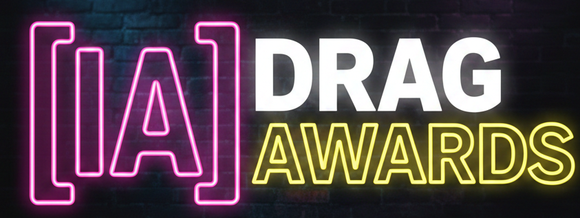
- Display typefaces: Designed for attention-grabbing headlines
When choosing a typeface, designers should consider readability, scalability, and compatibility with other visual elements. A well-chosen typeface enhances communication and aligns with the overall design intent.
Font Pairing and Contrast in Design Systems
Font pairing involves combining multiple typefaces within a single composition to create contrast and visual interest. When done correctly, it improves hierarchy and adds depth to the design.
Effective font pairing typically follows these principles:
- Use contrasting styles, such as serif with sans-serif
- Maintain consistency in proportions or structure
- Limit the number of typefaces to avoid clutter
- Ensure complementary visual tones
A balanced pairing allows each typeface to serve a specific role, such as one for headings and another for body text. Overcomplicating font choices can lead to inconsistency and reduce clarity.
Typography in Digital Interfaces
In UX/UI design, typography plays a functional role beyond aesthetics. It directly impacts usability, accessibility, and user interaction.
Important considerations include:
- Responsive scaling across devices
- Clear hierarchy for navigation and content flow
- Adequate contrast for readability
- Consistency across components and screens
Typography systems in digital products are often standardized using design systems that define font sizes, weights, spacing, and styles. This ensures consistency and improves the overall user experience across different pages and interactions.
Common Typography Mistakes to Avoid
Even with a solid understanding of typography, certain mistakes can negatively affect design quality.
Some of the most common issues include:
- Using too many different typefaces in one layout
- Ignoring spacing adjustments such as kerning and leading
- Poor contrast between text and background
- Lack of consistent hierarchy
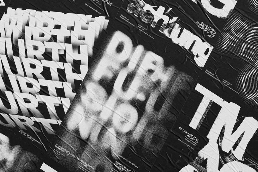
- Overuse of decorative fonts in body text
Avoiding these mistakes helps maintain clarity, readability, and professionalism in design work. Typography should always support the content rather than distract from it.
Advanced Typography Considerations for Professional Designers
As designers progress beyond the basics, typography becomes more refined and detail-oriented. Advanced typography involves understanding subtle adjustments that significantly impact readability, aesthetics, and user experience. At this stage, designers focus not only on selecting typefaces but also on optimizing how those typefaces behave in real-world applications.
One important aspect is optical alignment. Unlike mathematical alignment, optical alignment involves adjusting elements visually to achieve balance. For example, certain characters may appear slightly misaligned when placed in a grid, even if they are technically centered. Designers compensate for these visual discrepancies to ensure that layouts appear harmonious to the human eye.
Another advanced consideration is responsive typography. With content being viewed across multiple devices, typography must adapt fluidly to different screen sizes. This involves using scalable units, flexible layouts, and responsive breakpoints to ensure that text remains legible and visually consistent whether viewed on a mobile phone, tablet, or desktop screen. You need attention to micro details in advanced typography:
Attention to Micro-Details in Advanced Typography
Here is advanced typography also includes attention to micro-details such as:
- Fine-tuning kerning in headlines and logos
- Adjusting line breaks to avoid awkward spacing
- Controlling hyphenation and text flow in paragraphs
- Balancing contrast between type sizes and weights
These refinements may seem minor, but they collectively enhance the professionalism and polish of a design. Experienced designers often spend considerable time adjusting these details to achieve a refined final output.
Additionally, accessibility continues to be an important factor at advanced levels. Designers must consider users with different visual abilities and ensure that typography meets accessibility standards. This includes maintaining sufficient contrast ratios, avoiding overly small font sizes, and ensuring that text remains readable in various lighting conditions and devices.
Professional typography also involves testing and iteration. Designers often evaluate their typographic choices in real scenarios, gathering feedback and making adjustments based on usability and readability. This iterative approach ensures that typography not only looks visually appealing but also performs effectively in practical use cases.
Ultimately, advanced typography is about precision, consistency, and adaptability. It requires a deep understanding of both the technical and aesthetic aspects of type. By combining foundational knowledge with refined techniques, creative professionals can produce typography that is not only visually compelling but also highly functional, accessible, and aligned with modern design standards.
Conclusion
Typography is a fundamental skill that every creative professional must master to create effective and visually coherent designs. It influences how content is structured, how users interact with information, and how messages are perceived. From understanding type anatomy and hierarchy to managing spacing and font pairing, each aspect plays a vital role in shaping the final outcome of a design.
By applying typography basics consistently, designers can improve readability, enhance user experience, and build stronger visual communication systems. Rather than treating typography as an afterthought, it should be considered an integral part of the design process. A thoughtful approach to typography ultimately leads to clearer, more engaging, and more professional results across all creative disciplines.