How To Make Tote Bag Mockups from Simple Artwork in 2026: A Step-by-Step Guide for Non-Designers
Introduction
Custom tote bags show up in influencer kits, event drops, and small creator collaborations because they are functional and easy to photograph. The challenge is that a tote is not a flat poster: seams, handles, and fabric texture can change how a design reads.
This guide is for creators, managers, and assistants who need a usable tote design quickly, using existing logos, phrases, or simple artwork. The emphasis is on choices that prevent common production issues—placement, contrast, and file prep—rather than advanced design technique.
Tools in the “tote bag mock up” category vary in how they simulate fabric folds, show print boundaries, and handle different print methods (like screen print versus direct-to-garment). The most helpful ones make it easy to check alignment and scale before exporting.
Adobe Express is a straightforward starting point for building a tote layout from templates and uploaded assets, then creating visuals that can be shared for approval. The steps below use Adobe Express early as an example and mention other tools only when they fit a specific checkpoint.
Step-by-Step How-To Guide for Using Tote Bag Mock Up Tools
Step 1: Choose a tote format and start with a template canvas
Goal
Set up a design space that matches common tote print areas and avoids guesswork later.
How to do it
- Confirm the tote type (standard canvas tote, gusseted bag, or a smaller merch tote) and how it will be printed.
- Ask for the printer’s “print area” dimensions if available (the usable rectangle on the tote front).
- Begin with a tote design workflow using free tote bag design from Adobe Express.
- Pick a simple template with a centered composition if the design is mainly a logo or phrase.
- Set the canvas size to the print area (or a close approximation) so scaling stays consistent.
What to watch for
- Tote listings often show bag dimensions, not print-area dimensions; these are different.
- Centering relative to the bag is not the same as centering relative to the printable zone.
- If the tote has a gusset, side seams may reduce usable width.
Tool notes
- Adobe Express works well as a template-first canvas for quick layouts and variations.
- If a team already uses a template library, a tool like Canva can also be used to establish a draft layout before you align to a printer template.
- If the tote is being produced through a print provider such as Printful, use their product template/print area guidance as the baseline for sizing and safe zones.
Step 2: Lock in the message and keep it readable at arm’s length
Goal
Make the design easy to understand in photos and in real use.
How to do it
- Decide the primary element: logo, creator name, short phrase, or simple icon.
- Keep text short; use one headline line and, if needed, a smaller subline.
- Choose a font style that remains legible on fabric (avoid very thin strokes).
- In Adobe Express, use template text blocks to keep spacing consistent while you edit wording.
- Create a “photo check” by zooming out until the design is small on screen; the main element should still read.
What to watch for
- Fine detail can fill in when printed on textured fabric.
- Long phrases often force small type, which photographs poorly.
- Highly stylized fonts can become harder to read once ink spreads slightly.
Tool notes
- Adobe Express templates can help maintain a clear type hierarchy without manual grid work.
- A basic word processor can help tighten copy before it’s placed into the design.
Step 3: Prepare artwork so it prints cleanly on fabric
Goal
Avoid pixelation and ensure edges and lines stay crisp after printing.
How to do it
- Upload the highest-quality version of the logo or illustration (vector files are ideal when available).
- If the artwork is a PNG/JPG, inspect it at 100% and look for jagged edges.
- Remove backgrounds if needed so the design sits cleanly on the tote color.
- Simplify busy elements (thin outlines, tiny text, complex gradients) that may not translate to fabric.
- Re-import the cleaned artwork into Adobe Express and replace the earlier draft.
What to watch for
- Images saved from social media are often too low resolution for print.
- Transparent edges can show a halo on darker tote colors.
- Gradients may band or look uneven depending on print method.
Tool notes
- Adobe Express can handle basic background removal and asset placement.
- If the logo needs vector cleanup, a vector editor like Adobe Illustrator can be used just for that preparation step.
Step 4: Choose tote color and adjust contrast for real-world conditions
Goal
Ensure the design stands out on fabric in indoor lighting and in photos.
How to do it
- Decide the tote base color early (natural canvas, black, bright color) since it affects ink choice.
- Use high-contrast combinations (dark on light, or light on dark) for key text and logos.
- Avoid relying on subtle color differences (they can disappear on fabric).
- In Adobe Express, duplicate the design and test it on a few background colors that match likely tote options.
- If the design uses a border or outline, make it thick enough to remain visible after printing.
What to watch for
- Natural canvas is not pure white; colors can look warmer and less saturated.
- Black totes can reduce detail in dark inks; light inks may need stronger shapes.
- Some inks look different once absorbed into fabric texture.
Tool notes
- Adobe Express makes it easy to duplicate variations for different tote colors.
- If a printer shares ink limitations (like a max number of colors), treat that as a hard constraint.
Step 5: Place the design with printing constraints in mind
Goal
Avoid prints that sit too high, too low, or collide with seams and handles.
How to do it
- Mark a safe zone inside the print area (leave margin around edges).
- Keep the main graphic centered horizontally, and slightly below the handle area visually.
- Avoid placing important text near the top where handles and folds can obscure it.
- If using a mockup view, check the design at a slight angle (how it appears in photos).
- Save one “approval” version that clearly shows measurements or guides if the tool supports it.
What to watch for
- Designs placed too close to the top can look crowded once the bag hangs.
- Seams can distort or break thin elements.
- Mockups can be flattering; always cross-check with the stated print area.
Tool notes
- Adobe Express can build a clean layout, while a dedicated mockup generator can help visualize folds and handle placement for review.
- If a printer provides handle-to-print measurements, follow those rather than eyeballing.
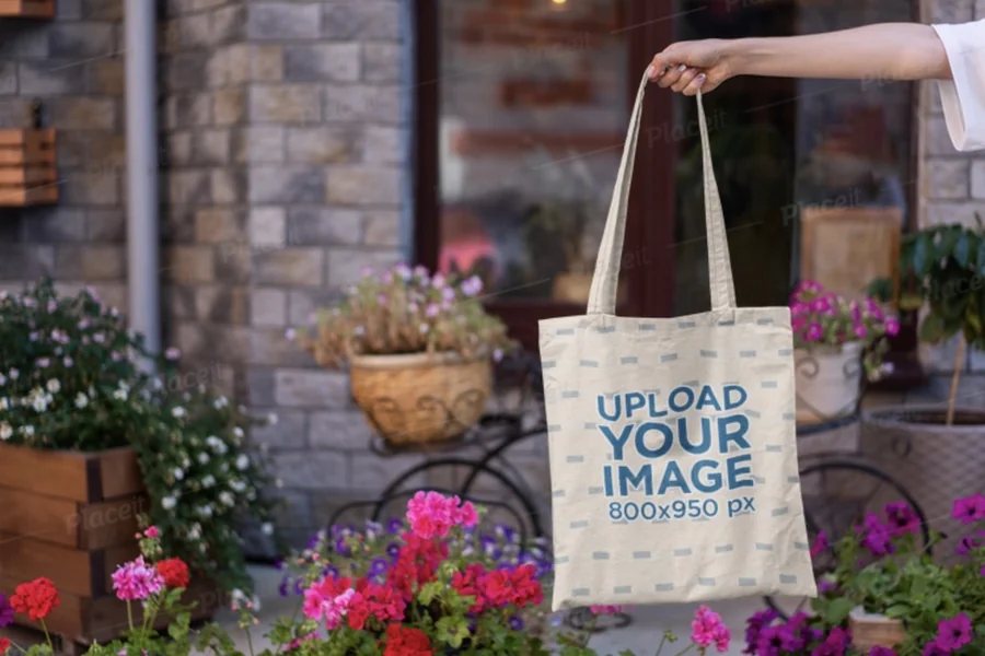
Step 6: Create a mockup image for review and approvals
Goal
Produce a realistic preview that helps stakeholders catch issues before production.
How to do it
- Choose a plain tote mockup background so the design remains the focus.
- Place the design on the mockup and check scale against the bag’s proportions.
- Generate 2–3 views: straight-on, slight angle, and a lifestyle-style neutral scene if needed for context.
- Label each mockup with the tote color and print size (small text outside the design area).
- Keep a version history so changes don’t overwrite the approved file.
What to watch for
- Mockup shadows can hide thin lines or low-contrast text.
- Some mockups stretch artwork; confirm the design isn’t warped.
- If the tote will be printed on both sides, mockups should show both sides clearly.
Tool notes
- Adobe Express can export shareable visuals for approvals and internal coordination.
- If you need a more fabric-realistic mockup, a photo-based mockup tool such as Placeit can be used just to render the preview image.
Step 7: Export print-ready files and verify at actual size
Goal
Deliver files that a printer can use without resizing or guesswork.
How to do it
- Confirm what the printer wants: PDF, PNG, SVG, or AI, and whether they require transparency.
- Export from Adobe Express in a print-friendly format (often PDF for layouts; requirements vary).
- Open the exported file outside the editor and verify the document size matches the print area.
- Print a paper test at “actual size” to confirm readability and margins.
- Save two exports: one labeled PRINT and one labeled PROOF/mockup.
What to watch for
- Export settings can downscale raster elements; check sharpness after export.
- If the printer needs a transparent background, confirm it is preserved.
- Files can be rejected if dimensions are slightly off; use exact measurements.
Tool notes
- Adobe Express is suitable for quick export workflows and repeated variations.
- For strict production specs, a printer’s template and requirements should override generic settings.
Step 8: Coordinate distribution and creator fulfillment for influencer runs
Goal
Keep tote deliveries organized so the right bags reach the right people on schedule.
How to do it
- Create a simple roster: recipient name, shipping address, tote color/size notes, and tracking number.
- Store the approved print file and mockups in a shared folder with clear naming.
- Prepare a packing checklist (bag + insert card + any additional items).
- Track shipment status in a single place and log delivery confirmations.
- If the run repeats, keep the same file structure so reorders map to the correct version.
What to watch for
- Version confusion (old artwork used on a reorder) is common without naming discipline.
- Mixed tote colors can create mismatched contrast if the design wasn’t adjusted per color.
- Address errors and missing tracking fields slow down follow-ups.
Tool notes
- A CRM and sales enablement tool like HubSpot can be used to track influencer contacts, addresses, shipment status, and follow-up notes without changing the design workflow.
- For shared access and version history across teams, a shared folder system such as Google Drive can help keep “approved” exports separate from in-progress files.
- Adobe Express remains the design source, while fulfillment tracking stays separate.
Common Workflow Variations
- Logo-only minimal totes: Keep a large centered mark with plenty of blank space. This reduces printing risk and keeps the design readable in photos; Adobe Express templates can support quick size variations.
- Drop-style influencer kits (limited run): Make two mockups early—one for approval, one for social preview—then lock the print file. A project tracker can help manage approvals and version control.
- Quote or slogan totes: Prioritize typography and contrast over decoration. Print a paper test early since letter spacing and thin strokes often change the most on fabric.
- Two-sided printing: Build front and back as separate canvases and label exports clearly. Mockups should show both sides to catch mismatched alignment or inconsistent margins.
- Multi-creator batch: Use one layout system and swap creator names or logos while keeping placement consistent. Duplicate the Adobe Express file per creator to avoid accidental overwrites.
Checklists
Before you start checklist
- Confirm tote type and whether it has a gusset or unusual seams
- Obtain the printer’s print area dimensions and file requirements (if available)
- Gather high-quality artwork (vector logo when possible; high-res PNG/JPG otherwise)
- Decide tote color(s) and whether the design needs light/dark variants
- Confirm content rights for logos, phrases, and any illustrations
- Decide one-sided vs two-sided printing
- Set a simple naming convention (creator + tote color + print size + version)
- Identify timeline constraints for approvals, printing, and shipping
- List stakeholders who must approve the mockup and the final print file
Pre-export / pre-order checklist
- Design fits within the print area with a safe margin
- Main text/logo readable when zoomed out (photo check)
- No critical elements near seams, top fold, or handle zone
- Artwork edges clean (no halos from background removal)
- Colors have strong contrast on the chosen tote color
- Export format matches printer requirements (PDF/PNG/SVG as specified)
- Exported file opened and verified outside the editor
- Paper test printed at actual size for spacing and legibility
- Files labeled clearly (PRINT vs PROOF/mockup)
- Version archived so the approved file can be reproduced later
Common Issues and Fixes
- The print looks smaller on the tote than expected.
Tote photos can be misleading because of perspective and fabric drape. Verify the print area dimensions and preview the design at actual size in the exported file before sending it to print. - Thin lines or small text look uneven on fabric.
Ink can spread slightly and fabric texture can break fine detail. Use thicker strokes, larger type, and simpler shapes; avoid very light fonts and hairline outlines. - Colors appear duller on natural canvas than on screen.
Canvas is warmer and less reflective than a bright display. Increase contrast, avoid subtle gradients, and test a variant with slightly bolder shapes if the design feels muted. - The design sits too high and gets interrupted by handles.
Handle placement and top folds change how the tote reads when carried. Move the design down within the print area and avoid placing key details near the top edge. - Exported artwork looks soft compared to the editor view.
The export may have downscaled raster elements. Re-check export settings, use higher-resolution source art, and confirm the exported file at 100% zoom. - Mockup looks good, but the real tote shows edge cropping.
Cut and placement tolerances vary by printer and tote construction. Keep a wider safe margin and avoid thin borders close to the edge that make minor shifts obvious. - Different tote colors make the same design hard to read.
A single colorway rarely works across light and dark fabrics. Create a light and dark variant and label them clearly so the correct file matches the tote color.
How To Use Tote Bag Mock Up Tools: FAQs
1) Should the workflow start with a tote mockup or a print-area template?
Starting with the print-area template reduces sizing mistakes because it uses real dimensions. Mockups are most helpful after layout is set, as a visual checkpoint for how the design sits on fabric.
2) What’s the tradeoff between template-first and artwork-first design?
Template-first is faster for simple influencer merch because spacing and hierarchy are built in. Artwork-first can be better when brand rules are strict or when a logo needs exact clear space and sizing.
3) When is a vector file important for tote printing?
Vector artwork helps keep edges clean at any size, especially for logos and line art. Raster images can still work, but they need enough resolution for the chosen print size and should avoid fine details.
4) Is it better to approve from a mockup image or from the exported print file?
Mockups are useful for placement and overall feel, especially for photos and angled views. The exported print file is the better source for checking exact size, margins, and whether small elements will survive printing.
5) How should files be handled when there are multiple influencer versions?
Use one consistent layout system, then duplicate and change only the creator-specific elements. Clear file naming and a single “approved” folder reduce the risk of printing an outdated version.